Grey Matter
And the 60-30-10 rule of decorating
After moving into a new apartment with her boyfriend last year, a friend’s daughter gave me a Zoom tour. “So, what do you think?”
The floors were that grey faux wood that’s been all the rage in the States for the past few years, though goodness knows why. Is it supposed to mimic teak that’s been exposed to the elements? (It doesn’t.) Is it a post-modern commentary on the commoditisation of nature, forcing us to acknowledge its very fauxness? (I doubt it.) Anyway, on top of that floor she’d layered a solid grey rug several shades darker than the solid grey sectional sofa, which was flanked by steel-grey side tables, the same as her bedroom nightstands. The baskets in her grey-washed storage unit were charcoal grey. Even her dog was largely grey.

At least he’s not solid grey.
“It’s very grey,” I said.
“I thought that would look sophisticated.”
“A little colour won’t kill you.”
I understand the appeal of grey. It’s neutral, so it lends a sense of security: How can one mess up neutral?
By going too neutral. Everyone has that acquaintance who never expresses a strong like or dislike for anything. He doesn’t have a favourite sport, never mind a favourite club. When asked what sort of food to order in, he says he doesn’t care, he likes everything, so long as it’s not too spicy. He’s fine to chat with for a few minutes, but you never can remember his name.
I suggested that my friend’s daughter add a few pillows and curtains in the colour she wears most. If a colour flatters you apparel-wise, it will also flatter you in your home.
I forgot that her wardrobe is primarily grey.
Luckily her boyfriend wears mostly blue. Armed with that info, she jumped onto Amazon (she’s on a tight budget) and found a quartet of chenille throw pillows, each a different shade of blue. (I tried to persuade her to go for stripes or some other pattern, but she said that felt “risky.” This from a woman who asked her parents for skydiving lessons for her 18th birthday.) Then we found some ombré blue curtains and a rug in an abstract blue-with-flecks-of-gold design to splurge on once she received her tax refund. I subsequently bought her a blue marbleised tray with gold handles as a housewarming gift.
I also told her she needs art. Colourful art. She’s working on it.

One of her nearly completed works. She’s quite talented, no?
In decorating there’s the 60-30-10 rule. Basically your main colour should account for 60% of a room, with a second hue making up about 30%, and an accent colour the remaining 10%. My friend’s daughter’s flat is now about 60% grey, 30% white (the walls, the storage units), and 10% blue. That 10% makes such a huge difference.
You can go monochromatic, of course. But if you do, you’ll want sufficient differences in tone among your main, second, and accent shades—for instance, navy blue, sky blue, and neon blue. And the closer to monochromatic your colour scheme, the more textural diversity you need.
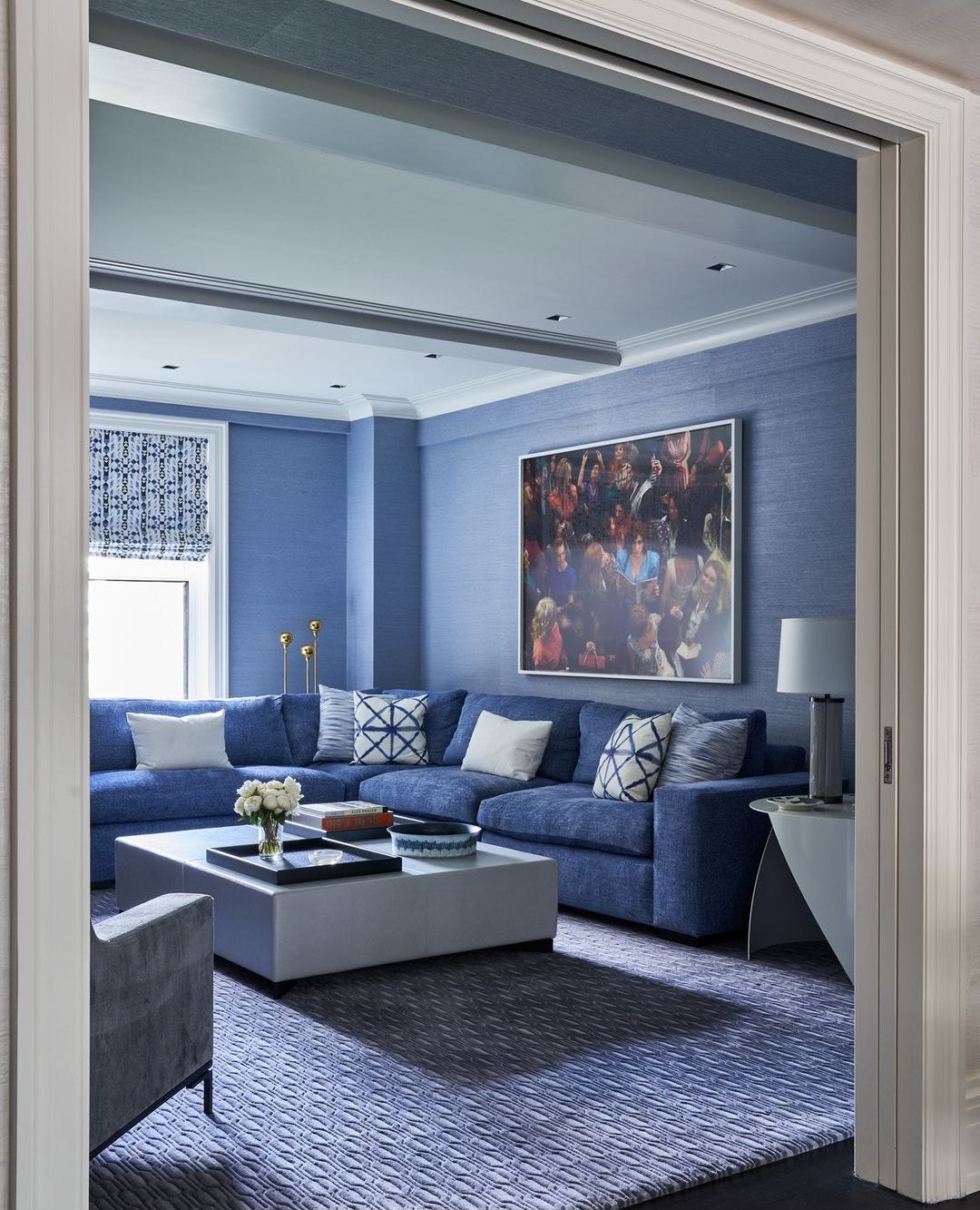
Diversity in texture and the inclusion of pattern make this blue living room by Eve Robinson feel anything but blah. Photo by Marco Ricca.
Yes, grey has its place. But that place shouldn’t be the floors and the upholstery and the case goods and the bedding and the throw pillows and the storage baskets of a home. In the case of my friend’s daughter, I wish she’d limit the grey to her dog.