


Room of the Week: In the Red
Forget the boring dictate about red being a poor choice for bedrooms
Photos by Jessica Delaney Photography.
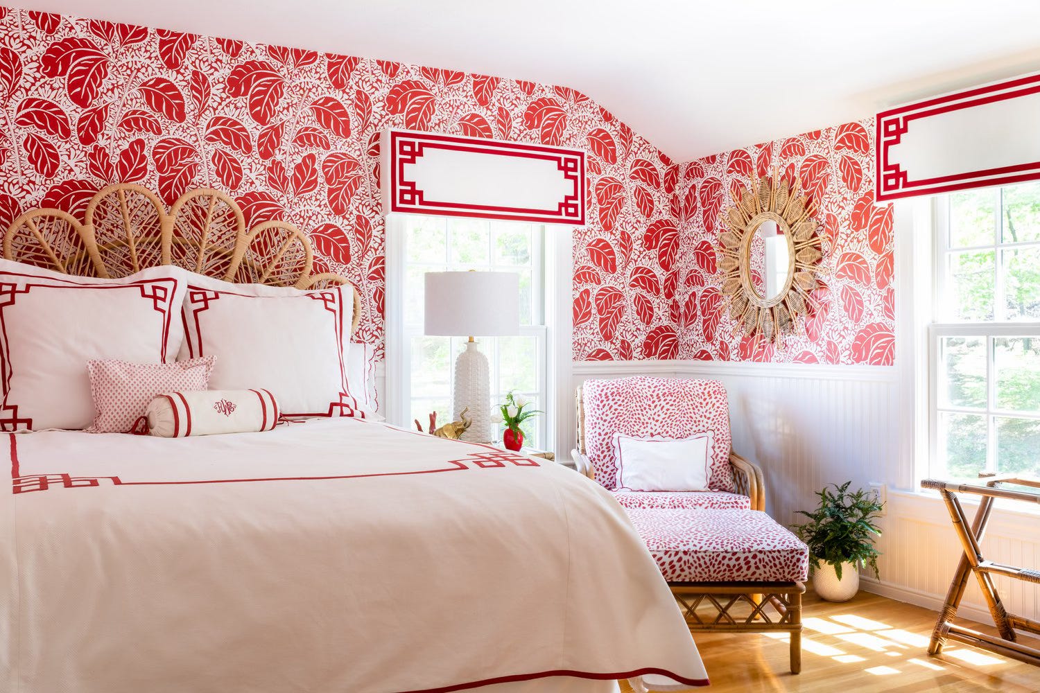
Conventional wisdom holds that red, orange, and other bold colours are too stimulating for use in a bedroom. That never made sense to me. For one thing, typically you turn the lights down or off when going to sleep, so how would you see the colours anyway? For another, wouldn’t waking up in a brightly hued room be more conducive to starting the day with vim than in a bedroom with a subdued palette, which might encourage one to hit the snooze button and go back to sleep?
Allison Mattison of Trellis Home Design, and the owners of this home, clearly agree with me.
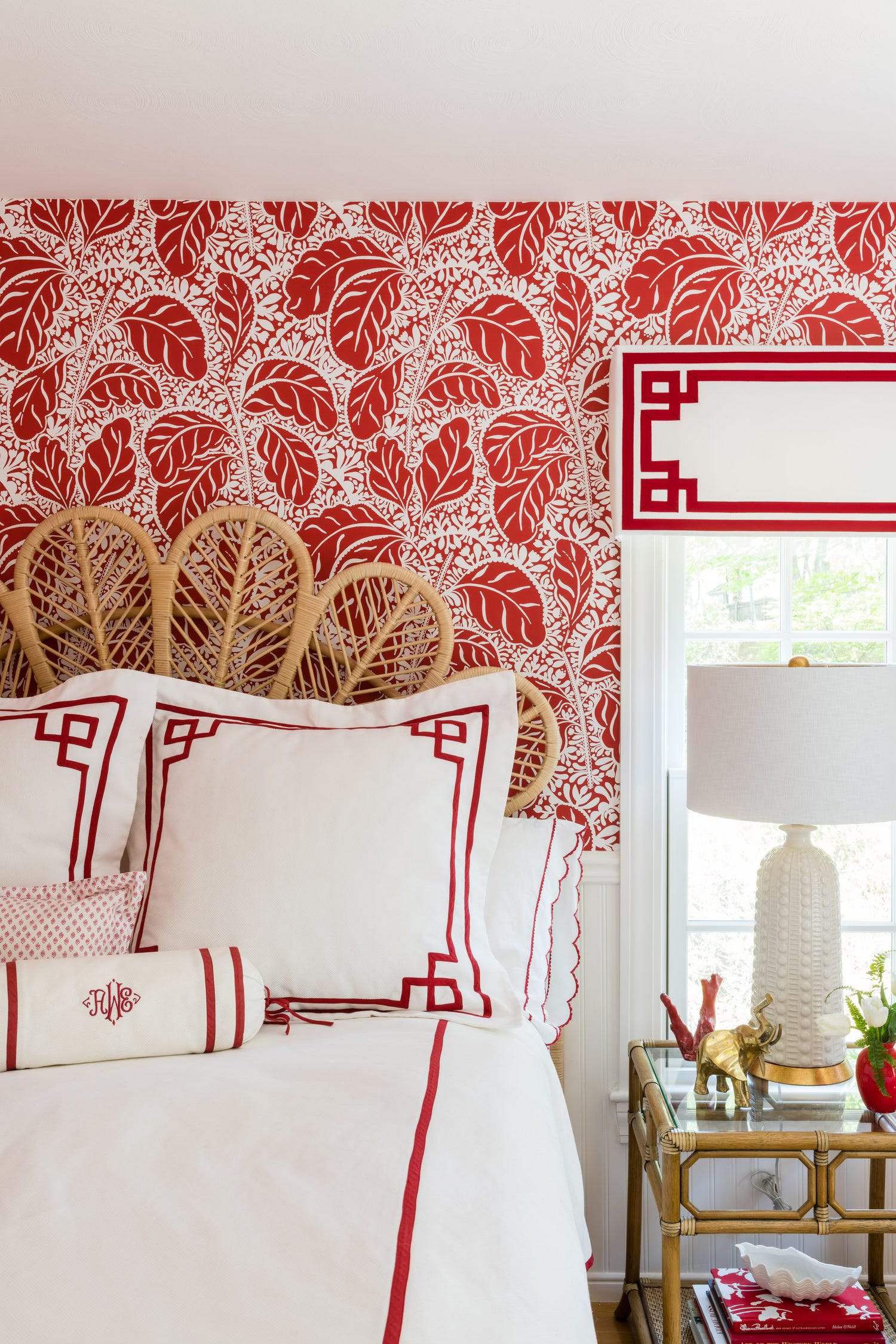
Complementing the cheery red with snowy white, and lots of it, ensures that the overall effect is uplifting but not frenetic. The airy forms and open weaves of the light-hued bamboo and rattan furnishings add to the light, fresh ambience. A dark brown floor, a deep-coloured rug, a sleigh or four-poster bed, bulky nightstands: Any of these would have made the room lean toward dispiriting.
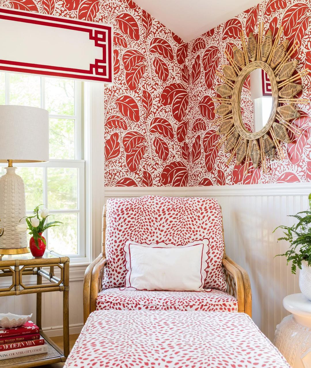
Though the pairing of red and white is what first commands attention, it’s the juxtaposition of traditional and whimsical that gives the bedroom its sophistication. The meander trim of the bedding and the valances (and in fact, the presence of valances at all!) is oh-so proper; the devil-may-care fronds of the wallpaper, not so much. The animal-print upholstery and the petal-like shape of the headboard add to the élan while also referencing classics of design. (The headboard, for instance, echoes the scallops of the shams, a touch of trad if ever there was one.)
To quote Taskmaster Greg Davies, “What have we learned today?” One, lashings of white can make even audacious colours feel convivial. Two, open shapes go a long way to making a space feel breezier. Three, don’t be afraid to mix classic with contemporary. (And four, I am indeed a huge Taskmaster fan.)
Love this. Thank you.