


To Drench or Not to Drench
Colour drenching is au courant—but will it soon become passé?
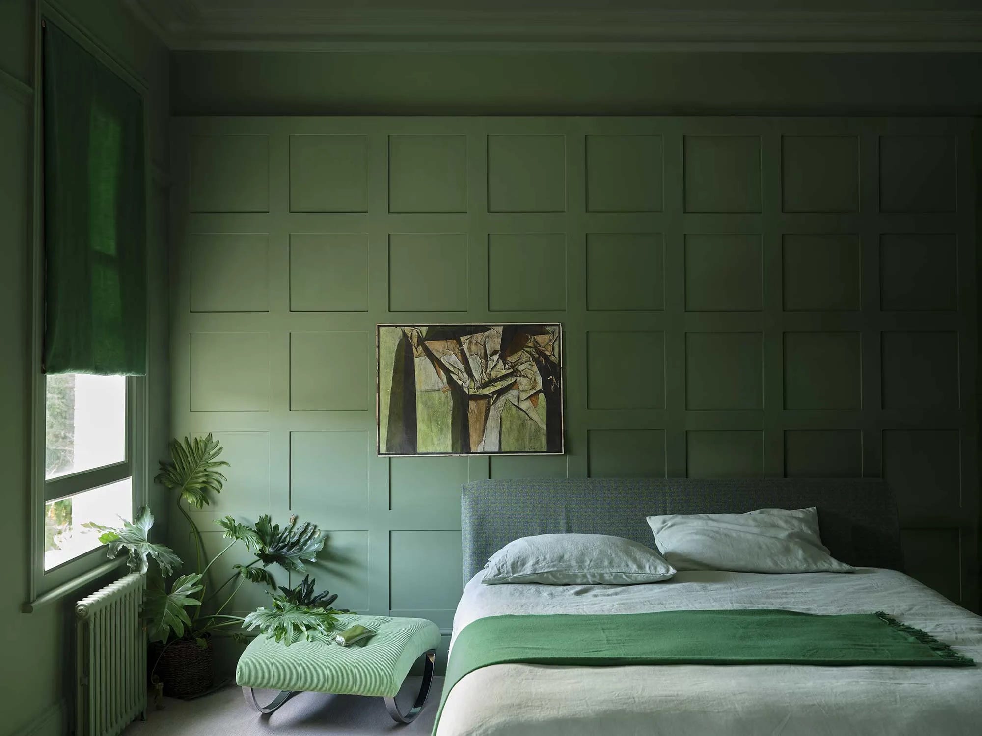
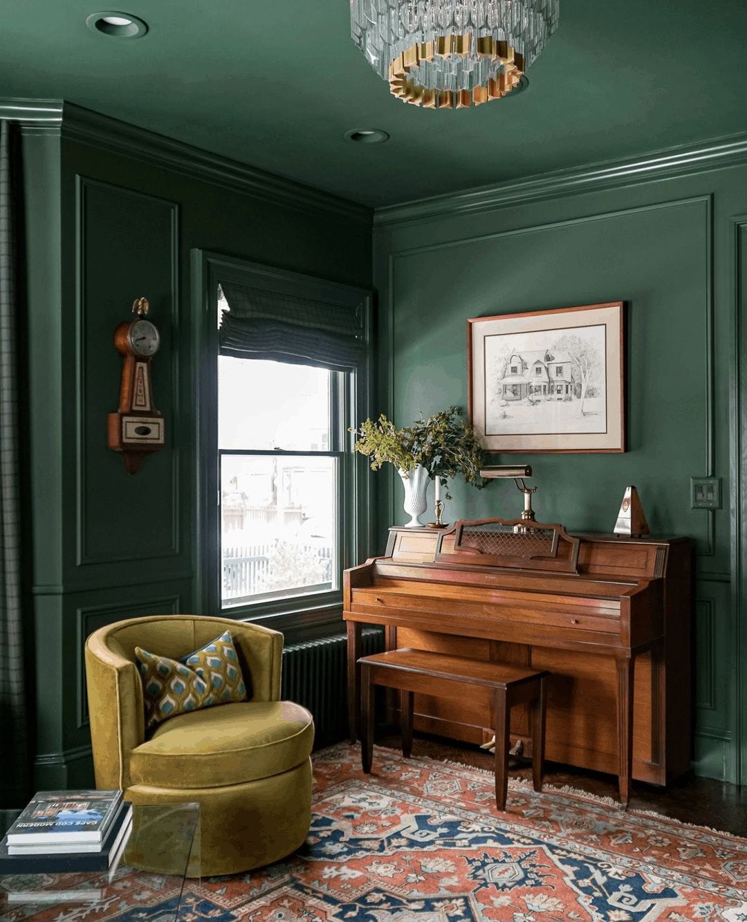
Rooms don’t get greener than this, painted in Farrow & Ball’s Calke Green, Dead Flat finish. Photo courtesy of Farrow & Ball.
Shelter magazines and blogs are practically drowning in content about colour drenching. If you’ve managed to escape the tide of these articles, colour drenching is when one paints not just the walls but also the doors, the ceiling, any built-ins, and the casements and other mouldings the same hue.
Proponents say it creates a comforting cocooning effect. Drenched in a dark colour, a large room can feel more intimate; in a light shade, a small room can seem to expand. And in a room that’s busy with dado rails and picture rails and dentils and such, painting them all the same hue can create a serenity that’s especially appealing in a bedroom or dining area.
That said, I can’t see myself opting for it. That’s probably because I grew up in a home devoid of trimwork, save for the most desultory of baseboards. I longed to have a house where I would accentuate lavish millwork with glossy white paint in bold contrast to scarlet or ultramarine walls. To me, obscuring all the mouldings is on a par with drowning steak in brown sauce. If one plans to do so, why order steak at all?
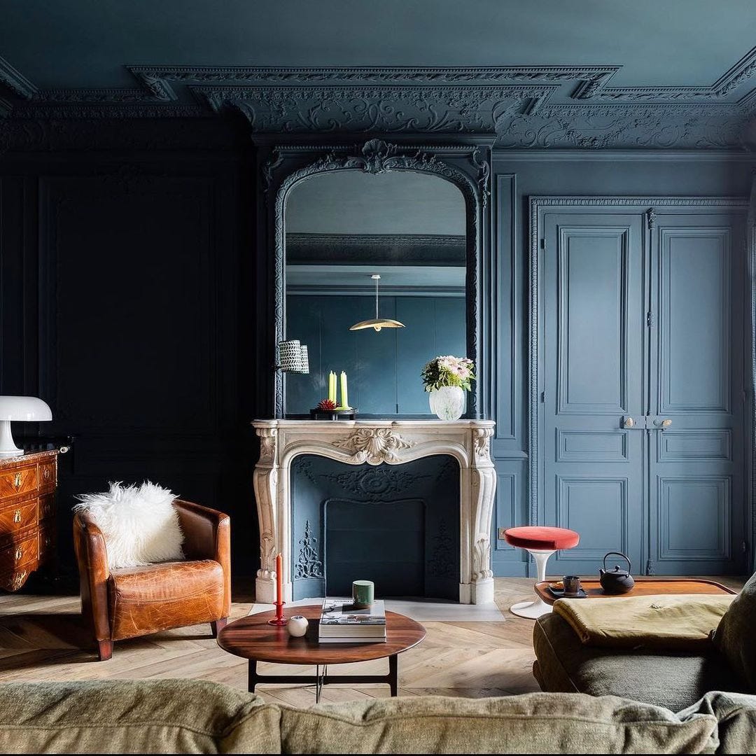
I guess I can see how the ornate millwork of this Paris apartment might feel overwhelming if it were all painted in a contrasting colour to the walls. The paint is, again, Farrow & Ball, this time Hague Blue. Design by M.A.H. Architecture; photo by Mathieu Fiol.
If you do fancy the look, please keep these tips and suggestions in mind:
• Before diving in, trial the colours in a major way. I confess: In my own homes, I pick a colour based on the swatch cards and get painting straight away. I love the frisson of surprise prior to seeing how the shade really looks in my rooms. You, however, should not do that unless you really, truly love all colours the way my niece adores all dogs, even those big slobbery ones. And especially do not do that with colour drenching. Instead cover sizeable portions of the walls with your intended paint or, barring that, large pieces of paper or board to place in every direction of the room. A green that’s lush in morning light might look sickly in the afternoon; a pink that’s subtle on an east wall could appear garish on the western side. Better to find out before you’ve doused every surface with paint.
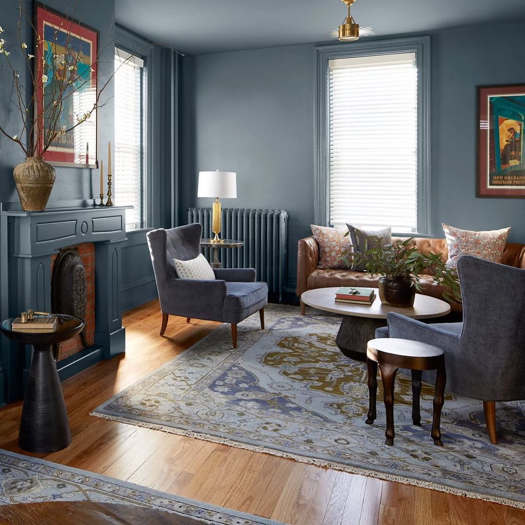
I do like how the radiator fades away in this room by Michelle Gage Interiors, and how the leather sofa pops. The blue fireplace surround, however… Photo by Brian Wetzel.
• Consider the finish as well as the colour. Most drenched rooms I see are painted in a flat finish. Given that flat and eggshell finishes are much more forgiving of surface irregularities than satin and gloss finishes, that makes sense. However, glossier finishes are easier to clean, and they bounce light around rather than soak it up.
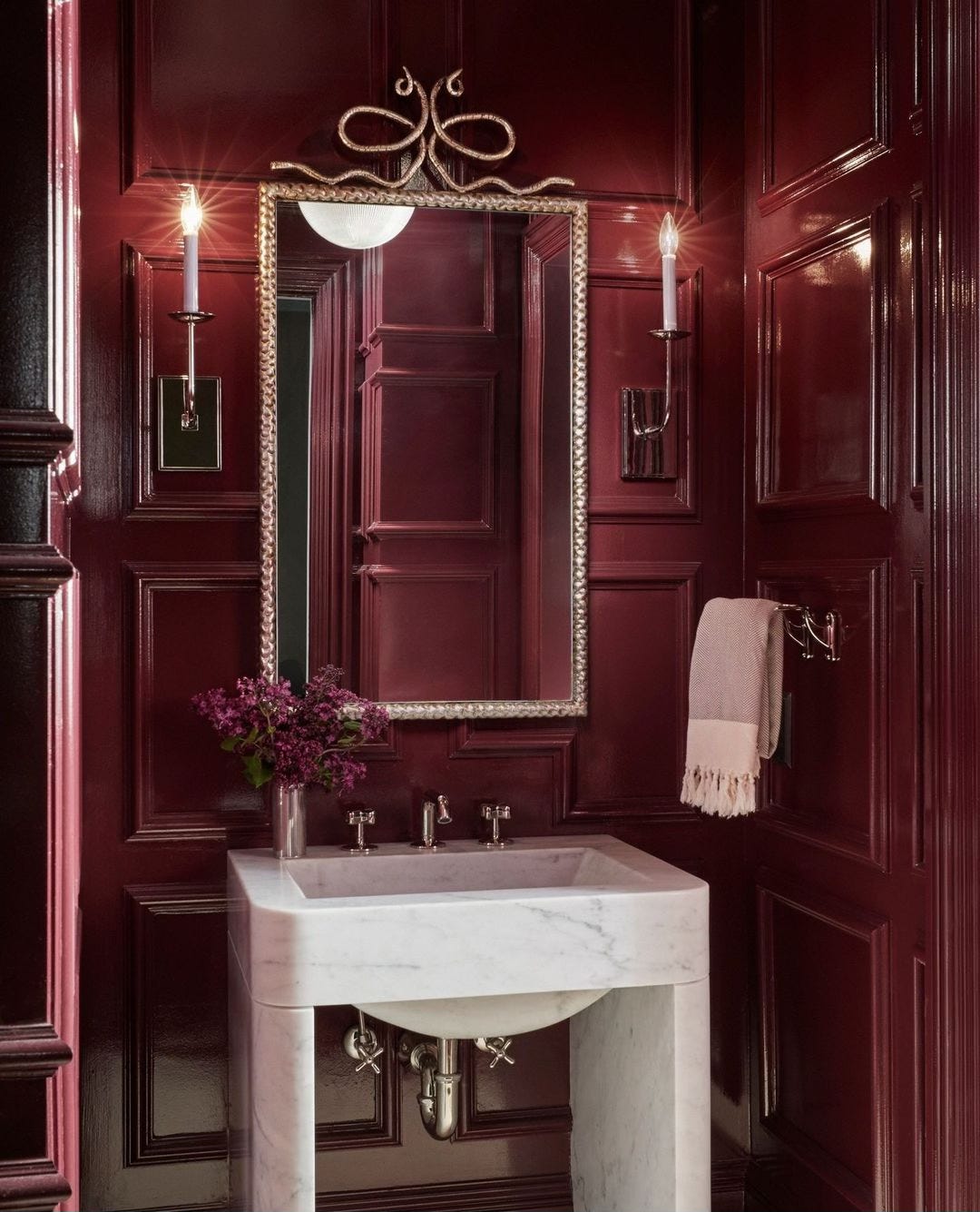
This powder room by Summer Thornton Design would be too drab if the aubergine walls were flat rather than glossy, no? Plus splashes of water from the sink would create blotches on a flat paint. Photo by Werner Straube.
You could use a glossier finish on the trim or the ceiling than on the walls. It’s a subtle way to mitigate the chalkiness of an all-flat finish as well as to play up the mouldings just a bit. And I do love a glossy ceiling.
Here, Renovation Husbands opted for Benjamin Moore’s Colonial Verdigris in matte on the walls and ceiling and semigloss on the trim.
• Think beyond paint. If you want to really go for, match your backsplash, wall tiles, or flooring too. In for a penny, in for a pound and such. Some even go so far as to include furniture and textiles in the same color.


In the Mozart Suite at Altstadthotel Weisses Kreuz in Innsbruck, Austria, the varied textures help make up for the lack of varied colours. And at least the ceiling was left bare.
A caveat: I expect colour drenching to quickly become passé. Just as harvest gold appliances date a kitchen to the 1970s and white shiplap screams the mid-2010s, I predict colour drenching will become notorious as a 2020s fad.
And one more thing: Please please please don’t cover everything in flat white or magnolia. After all, this look is called colour drenching, not sad off-white drenching.