


No. Just No
No. Just No
When decorating your home, anything goes—but...

This beauty is from Terrible Real Estate Agent Photographs, which you really should be following.
One of you lovely readers asked if I could put together a list of decorating don’ts. I’m a firm believer that if it makes you happy, it’s a decorating do. After all, you’re the one living in the home. So if pairing purple-and-pink stripes with red-and-blue plaid brings you joy, go for it. Ditto walls covered in cheesecake posters from the 1970s, the taxidermied remains of your childhood companion Fluffy as a centerpiece, or a floor covered in sand (never change, Hildi from Trading Spaces—and never get your hands on my home either).
BUT…
(You knew a but was coming.)
If you’d like to have a home that is generally agreed to be somewhat tasteful and practical, or if you think there’s something amiss with your space but can’t put your finger on it, keep these decorating don’ts in mind.
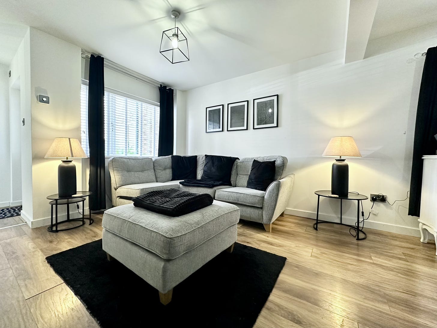
Don’t choose a rug that’s too small. Every single designer I’ve ever commiserated with cites a too-small rug as the number-one no-no. So how do you know if your rug is too small? A few rules of thumb:
In a living room or family room, at least the front legs of the main furniture grouping—sofa, chairs, that sort of thing—should rest on the rug.
In a bedroom, there should be at least a meter/3 feet of rug visible on each of the long sides. If you’d like the rug to extend beyond the foot of the bed, that’s also fine. So are runners in lieu of a rug.
In a dining area, not only should all the table and chair legs fit on the rug when the room is not in use, but the rug should extend at least 60 centimeters/2 feet beyond. You don’t want someone’s chair to be half on/half off the rug when they’re sitting down to eat.
A rug should not act as an ottoman coaster.
Can a rug be too large? Yes, though it’s rarer. At least 15 centimeters/6 inches of floor should be visible between rug and wall; otherwise it will look as if you mismeasured wall-to-wall carpeting.
Don’t skimp on curtain length. Leaving aside cafe curtains, which are meant to stop at the windowsill, the hem of your drapes should kiss, or at least air-kiss, the floor. Some people like the drama of drapes the puddle slightly on the floor. And some even make a case for apron curtains, which typically fall midway between a sill and the floor. The rationale for these is they allow clearance for the radiator. I contend that’s nowhere near a strong enough justification to allow them. These curtains remind me of the outgrown trousers I had to wear as a child, even when the hems stopped well above my ankles, because a replacement pair wasn’t in our budget.

I call these high-water curtains. I’d replace curtains with shades if I wanted to ensure the radiator was exposed.
While we’re on the topic of skimpy curtains, their width should be about 1.5 times the width of the window. Otherwise they’ll feel miserly.
Don’t rely on just one light source per room. Ideally each room should have ambient, accent, and task lighting. Ambient lighting are generally ceiling fixtures that cast diffused light throughout the room. Accent lighting is what you’d expect: Lamps, sconces, picture lights, and such that accent a particular feature—sconces flanking a fireplace, say. And task lighting such as desk or bedside lamps provide concentrated light for reading, working, and, well, tasks. Don’t tell my colleagues, but I think especially in a smaller room, you can get away with just two types of light. But just one? No; the room would seem flat when lit and have too many shadowy areas.
Don’t line up all your furniture against the walls unless it’s absolutely unavoidable. Furnishings aren’t wallflowers. They like to interact with the other pieces in a room. Yes, in a teensy space there might be no other way to fit your larger pieces. (Trust me, I know.) But even angling a side chair can help (don’t listen to Kelly Hoppen on this topic, or on the subject of mixed flowers either, though I agree with her re. chopping pillows).

A room shouldn’t resemble your first school dance, with the boys lined up against one wall and the girls lined against the opposite one.
Don’t hang your art too high (or too low). I’ve already posted a few guidelines here.
And that’s it, really. Oh, and because I don’t want to leave you with that sad image above, here’s a needlework from my friend @cruelty.free.cass.


So funny!