


Home Is Where the Art Is
Home Is Where the Art Is
Are there dos and don'ts when choosing art?
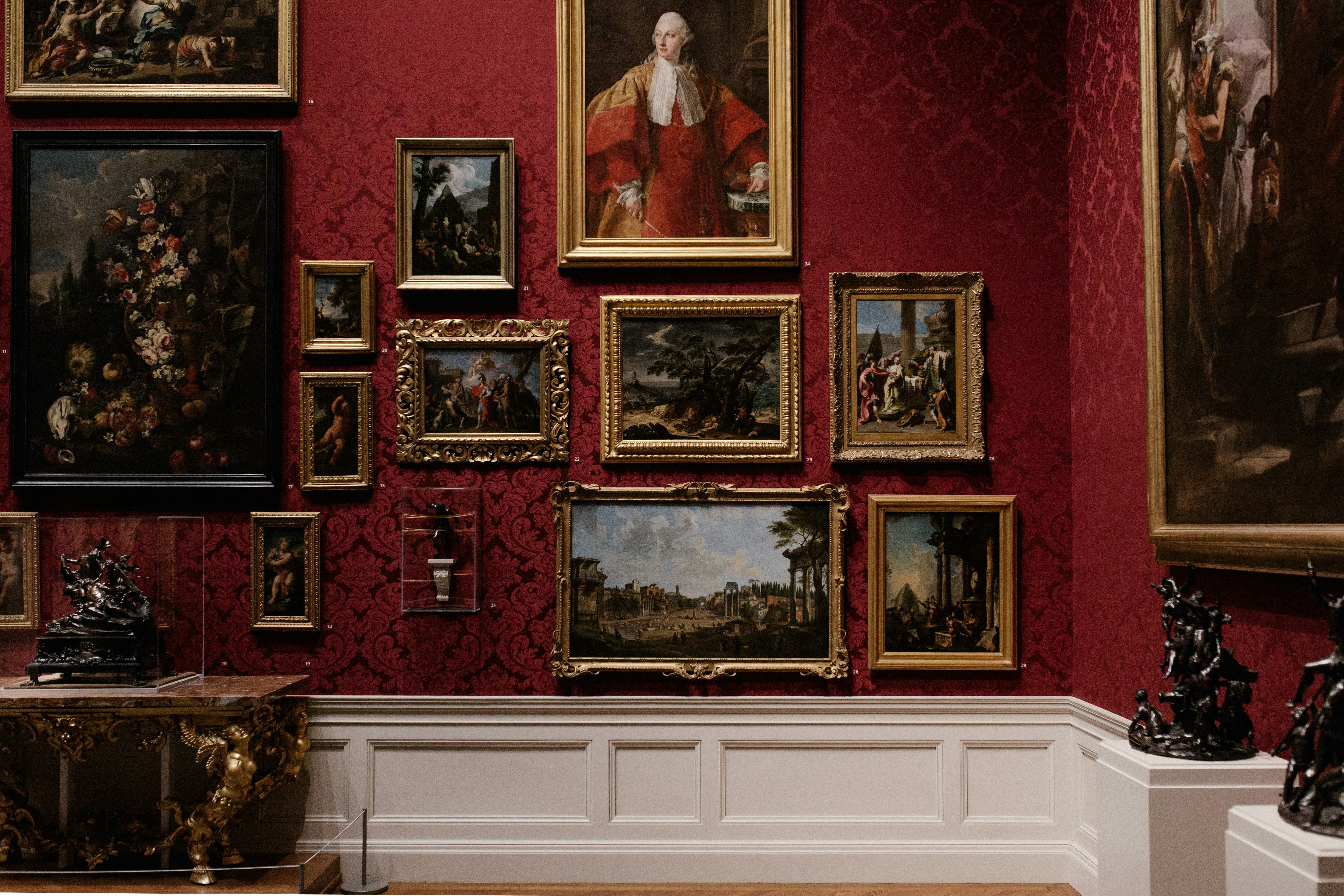
Photo by Andrew Neil/Unsplash.
A reader asked me to write about how to choose art for the home. It’s simple, really: Choose what you love. All those “rules” about picking paintings with a palette that coordinates with your textiles, in a style that’s sympathetic to the era of your furnishings—they’re all bollocks twaddle.
If you fall in love with an energetic Pop Art painting that’s all greens and violets but your home is laid-back earthy neutrals, go for it. (Buying art because it matches your sofa ends up making your living room look like a hotel that wishes it were as refined as a Premier Inn, no?) If your furniture is Mid-Century Modern but you simply can’t get over that Romantic landscape you spied in a gallery window, march right back to that gallery and make it yours.
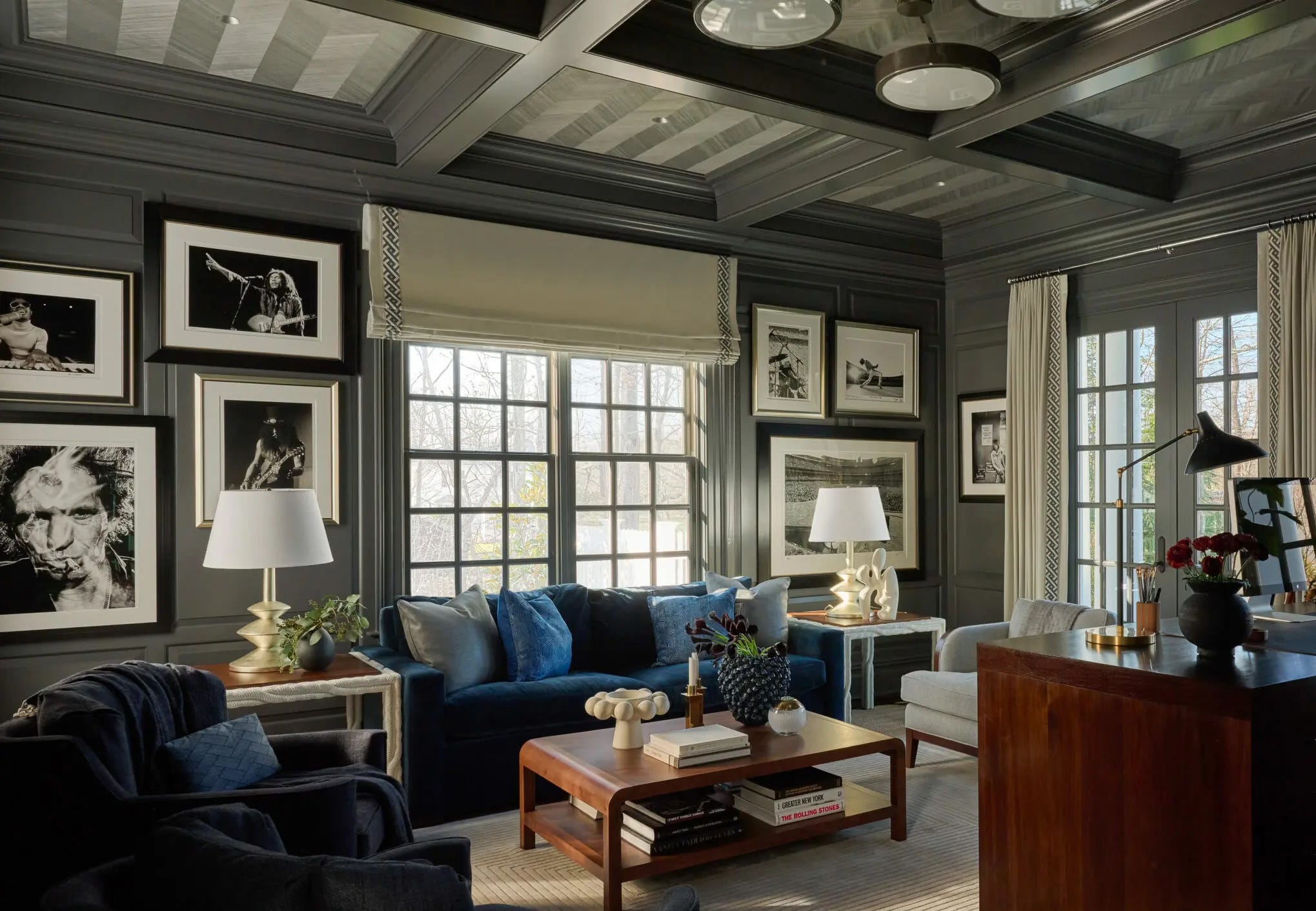
Trad meets rock-and-roll in this room by Roughan Interiors. Not only are the images of Keith Richards, Slash, and Stevie Wonder unexpected among the classic millwork, but so is the way that the photography is hung as if the mouldings simply weren’t there. Photo by Jane Beiles.
Your home should be a sanctuary where you can luxuriate among your favorite things. Besides, if you love the artwork and you love your furniture, your room’s palette, etc., they must share some commonality that enables them to work together… even if that commonality is nothing more than your loving them all.
That said, there are a few guidelines to keep in mind when it comes to hanging art:
• The center of the artwork should be roughly eye level for a standing person, so 57-63 inches/145-160 centimeters off the ground. If you’re grouping multiple works for a gallery wall, this applies to the center of the configuration.
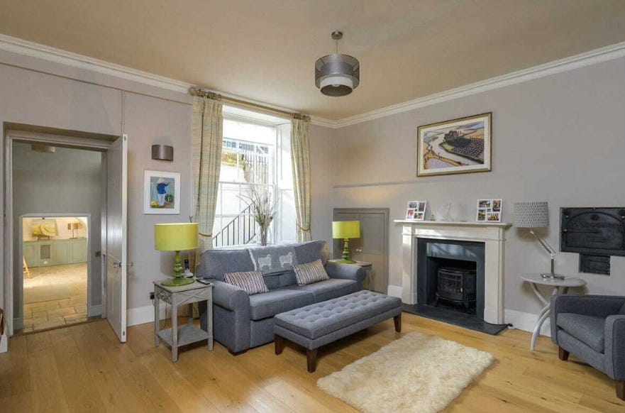
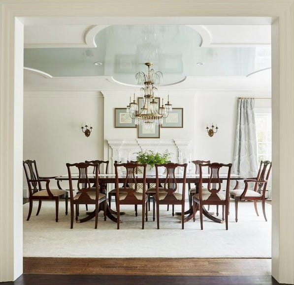
The art hanging above the fireplace is awkwardly high, no? Based on the door frame, the center appears to be about 80 inches/203 centimeters above the floor. It seems to be hovering above the mantel, disconnected from the rest of the furnishings.
• If you’re anchoring the artwork/gallery wall to a piece of furniture—above a sofa or a console table, say—the art should be at least two-thirds the width of the furniture. It will also look best if the bottom of the art is about 5-8 inches/13-20 centimeters above the top of the furniture.
• Using art to fill an empty expanse of wall? The two-thirds guideline still works.
Note that these are only suggestions, designed to ensure that the artwork feels integrated into the room. If they don’t work for you and your room, go ahead and experiment. In my current workspace, my primary artwork is lower than the guideline so that it’s centered in my field of vision when I’m seated at my desk; the way my room is arranged, there’s no occasion when I’d be gazing at it whilst standing. To ensure that that placement feels intentional, however, it is centered between two bookcases—the Ikea Billy cases with the wallpapered insides I mentioned in an earlier post.
Speaking of centering, you can’t go wrong creating symmetry with your art: centering it on a wall, flanking a mirror with works of equal size. But sometimes an intentional asymmetry provides the frisson of the unexpected that a room needs. An asymmetrical placement also ensures that the artwork catches the eye. Even then, however, it’s best if the art is visually tethered to something in the room. In my current flat I’ve had to break up a series of vintage prints I’d previously grouped together. They’re now scattered amid myriad oddly configured nooks, as there are no expanses of wall to accommodate them as one unit. But I’ve made sure that the top of each print in a room is the same height so that there’s a cohesiveness and consistency even amid the very inconsistent spaces. (I don’t think there’s a single plumb line or right angle in the entire flat!)
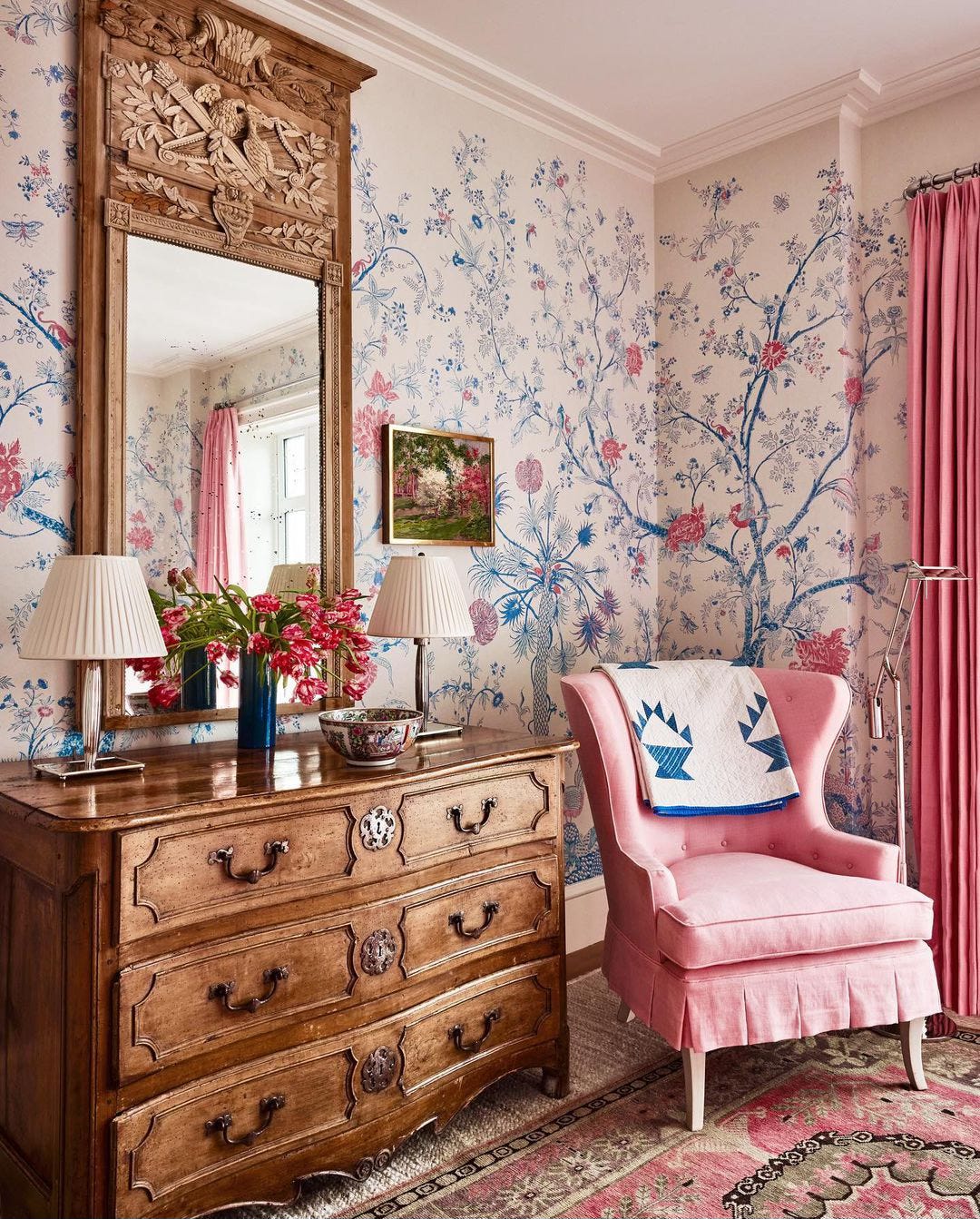
Had that petite painting been centered between the mirror and the adjacent wall, it would have looked orphaned. By placing it close to the mirror, even though there’s no complementary art on the other side, Redd Kaihoi design team created a sense of unity and draws more attention to the artwork.
And regardless of where you place your art, if you don’t feel it meshes with the rest of the room, try picking out a colour from the work and adding it as an accent elsewhere in the room. (Our most recent Room of the Week used flowers to do this.) A throw, a pillow, a vase in the same hue is all it takes.
I’m luxuriating that you ran with a reader's art question. Thanks!