Ode to Orange
Surprisingly versatile, whether you opt for a dab, a dollop, or a drenching
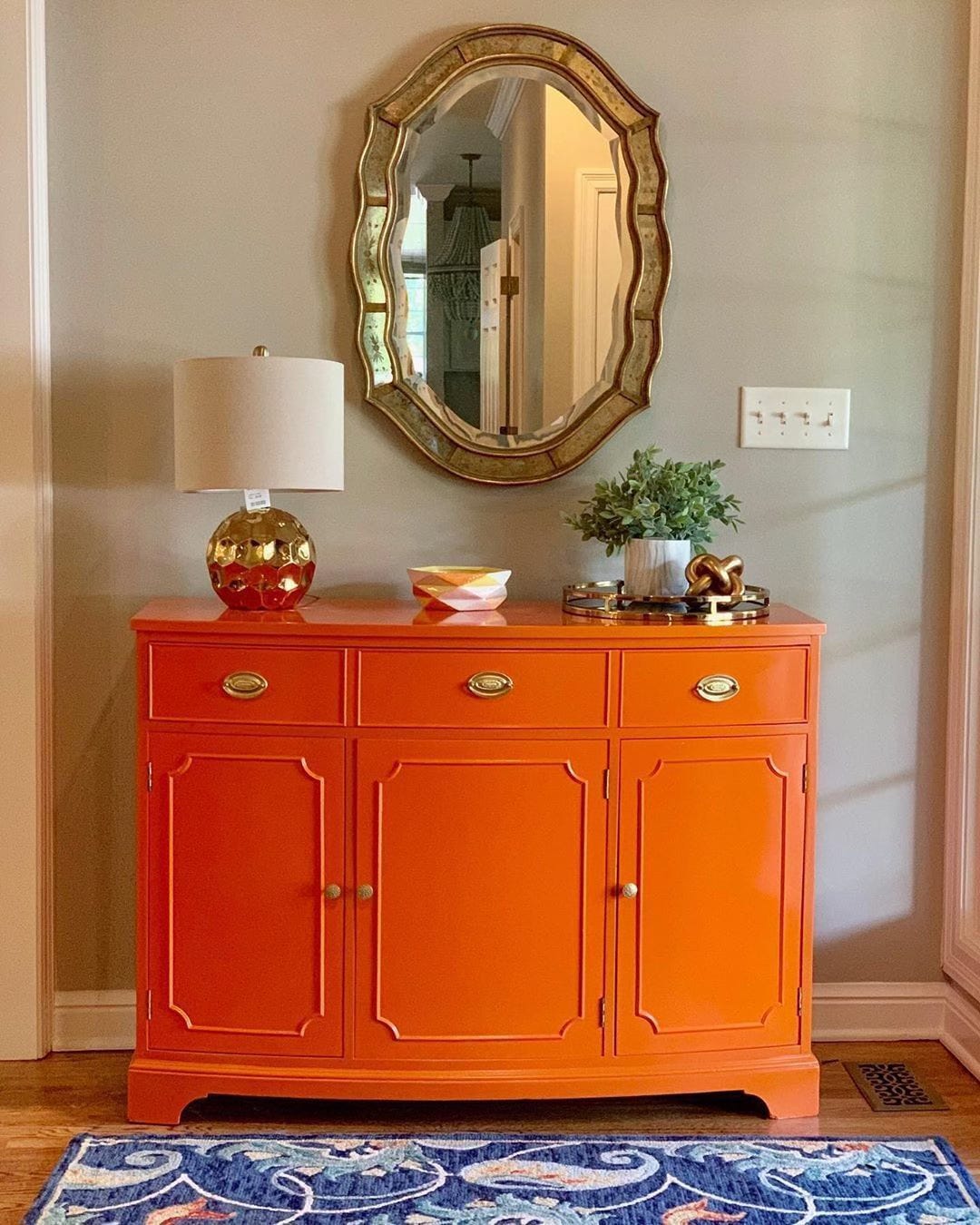
Photo courtesy of @theresplendentcrow.
So many shelter magazines and tastemakers are bigging up brown right now. Some of it has to do with the season—brown is nothing if not autumnal. Then there’s the rediscovery of 1970s style (or “style”), loved by those born several decades after its peak and loathed by those of us who suffered through it the first time. And I’m sure some of the buzz around brown is a reaction to this summer’s huge “dopamine decorating” micro-trend.
The thing is, brown is difficult not to decorate with, seeing as it’s the colour of most woods. And though brown leather can feel stately and brown velvet luxurious, too much brown often creates a room that’s sombre. That’s fine for a boardroom or a library, perhaps, but not what many of us want in a space designed for enjoyment.
But orange, while autumnal and appropriate for a ’70s vibe (for those who want that sort of thing), is happy. Yes, there are rust and burnt orange and other hues that lean brownish. However, real orange—and tangerine, pumpkin, carrot, and such—is unadulterated joy, like a Golden Retriever puppy.
Obligatory Golden Retriever puppy pic, courtesy of Aly’s Golden Retrievers.
Granted, not everyone loves puppies. And Golden Retriever puppies can come on a bit strong, to the point that one might contend it’s possible to have too much joy. In which case, adopt the “unexpected red theory,” but instead of adding a touch of red to a room, make it orange. An orange lampshade, vase, or bouquet in an otherwise neutral space or one with a tight palette will bring more joy and be more unexpected than red.
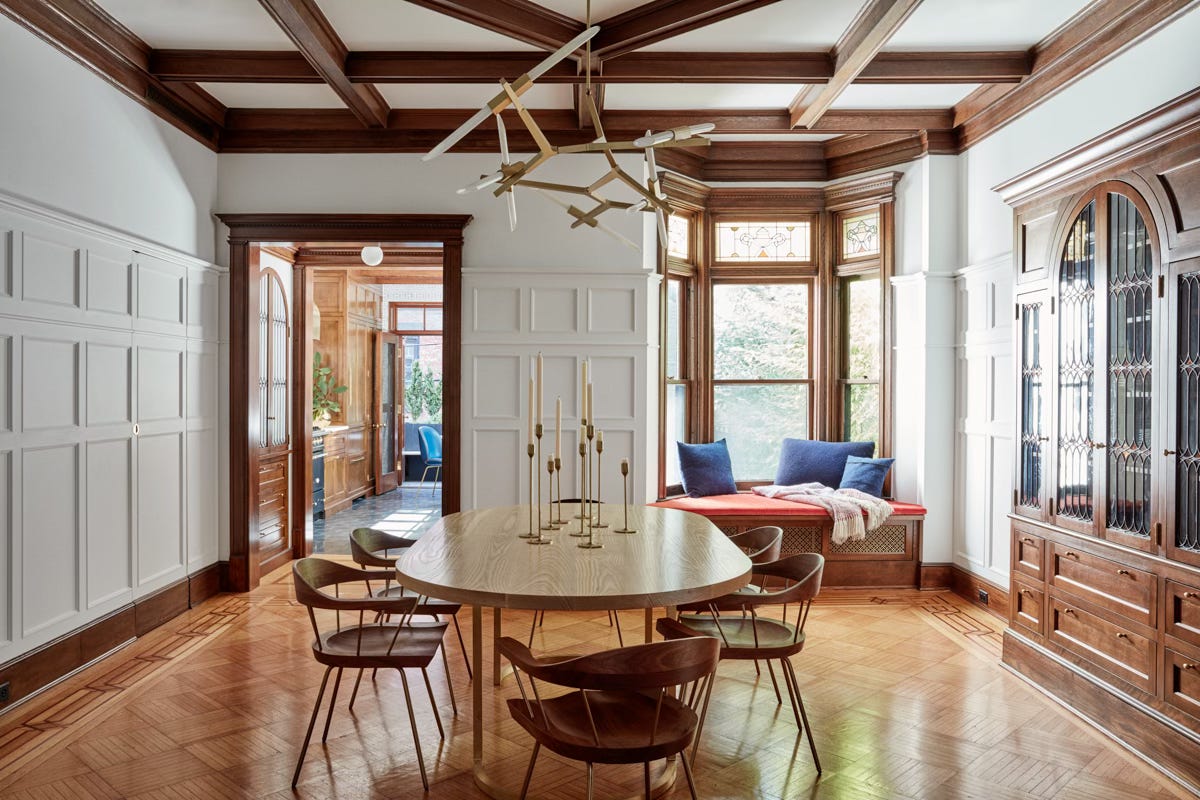
In this dining room by Jessica Helgerson Interior Design, the orange window-seat cushion is warmer and less formal than a red cushion would have been, and it complements the brown tones to perfection. Photo by Christopher Sturman.
Need some inspiration? Read on…
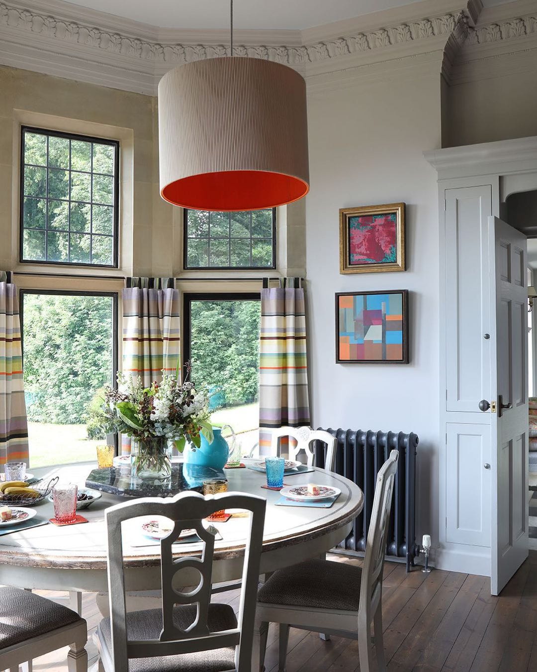
More unexpected orange theory in artist Susi Bellamy’s kitchen. I’m sure when the pendant is turned on, the shade imparts a wonderfully warm and flattering glow. Photo by James Balston.
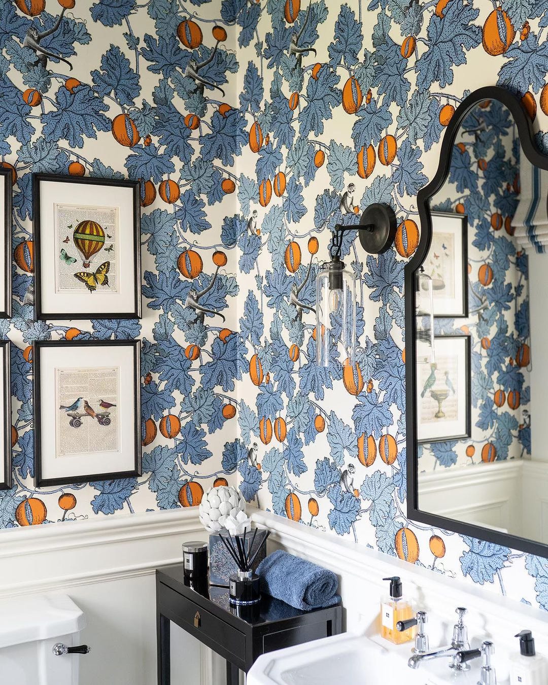
A complementary colour scheme features two hues opposite each other on a colour wheel: typically a primary colour (blue, red, or yellow) and a secondary colour made up of the remaining two primary colours. Here it’s blue and orange, as the latter is a mix of red and yellow. In this cloakroom by Thompson Clarke Interiors, Cole & Son’s Frutto Proibito wallpaper shows how delightful a complementary colour combo can be.
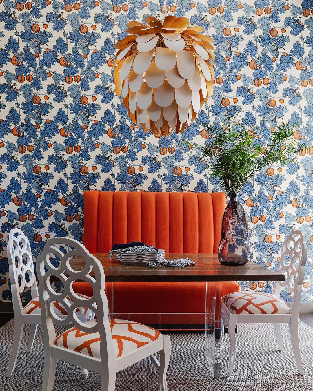
Here’s that Frutto Proibito again, this time in a breakfast room by Cindy Witmer Designs. Here the banquette and chair upholstery plays up the orange rather than the blue, so that the wallpaper—and the room—leans more devil-may-care than in the photo above. A blue, black, or white banquette would certainly work, but the ambience would be more sedate.
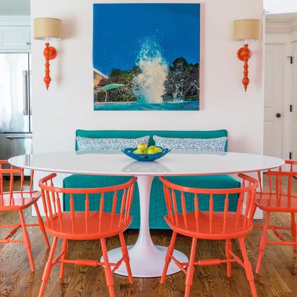
More orange and blue (and aqua), courtesy of Martha’s Vineyard Interior Design. The Rachel sconces from Dunes and Duchess reinforce the intentionality of the orange chairs without detracting from the breezy vibe.
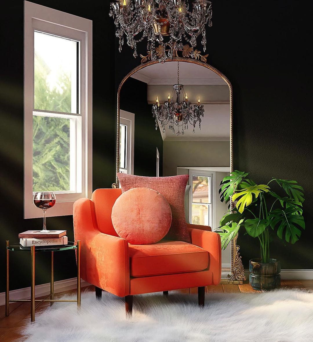
Lest you think orange cannot be elegant or sophisticated, Wilson-Owens Interior Design is here to prove you wrong. The key is to surround it with timeless shapes, luxurious materials, moody hues, gold, or bronze—or all of the above.
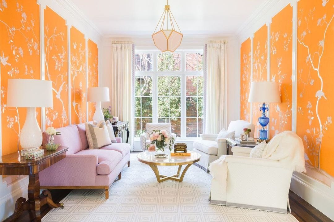
By displaying chinoiserie panels with an orange background rather than the more typical blue or gold, Collins Interiors breathes fresh life and youthful energy into an otherwise firmly traditional room. (And I adore the juxtaposition of the lavender sofa against the orange!) Photo by Alyssa Rosenheck.
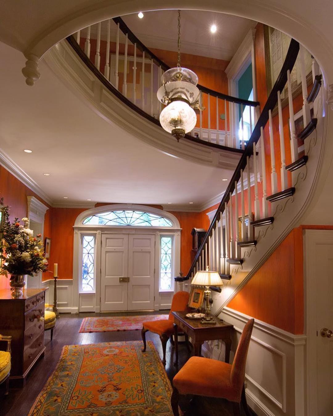
Some might consider orange walls a step too far. I don’t, and neither does designer Lee W. Robinson apparently. The white millwork certainly prevents the colour from being overpowering… as does, counterintuitively enough, the addition of orange upholstery and rugs. The walls would have been a distraction were they the only hit of orange; now, they contribute to the harmony of the space.
These various images show that orange is much more versatile than you might have thought. Even a single orange accent will instantly update a tired all-grey or all-beige room. Give it a go; you can thank me later.



I live a pop of orange!